Every time I find myself socializing with a bunch of other filmmakers, whether it’s at the local BOSCPUG user group meeting or some editor’s conference, I’m inevitably asked for a business card. However, I don’t have one. When I’ve thought of getting one, I always hold out, finding the options always to be so blah. I’ve thought of ways I might make it unique and stand out, but the one missing piece I’ve struggled with is a lack of an “identity”. You know, that collection of visual devices and cues – from colors, typography, images, to basically anything visual that represents you like a website, videos, cards, etc. The visual details that communicate who you are and what you represent, and ultimately, can form the foundation of an overall brand. Well, I don’t feel I have one of those “identities”, but last year, I thought I’d try my hand at developing one.
I can’t say I have anything completely flushed out, but compared to a year ago, it feels like something is converging. It started with a revamping of my site, using a different color scheme that’s a little…more me (anyone who knows me well knows I’m a solids and earth tones kind of guy). Next was trying to come up with a logo I could use on the site and most importantly, as a bumper on my videos. I was kind of tired relying on fonts and generic lines like “filmed and edited by” to identify myself. Was looking for something more.
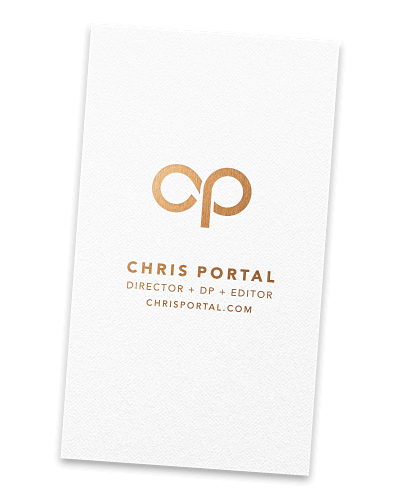
Enter Tim Smith. Tim is a good friend of mine, and a super talented and successful designer (he’s designing stuff for a “little” search engine company out on the west coast), who I asked a big favor of – to design a logo around my initials. A monogram essentially. I provided him various examples of what I had in mind, and what I was trying to evoke with it. He was kind enough to take my request on as a little side project, iterating on a few mockups, and ultimately landing on the icon and lettering profiled here. As Tim writes on his website:
The monogram represents the initials C.P., and the flowing circular letterforms serve as both a bold emblem and a subtle nod to film reels.
Check out Tim’s site and his profile of the logo he designed. Oh, and as far as those business cards…still don’t have one, but I at least have something to work off of now!